Graz–Jan. 28, 2025
Today’s Post is Brought to you by the Letter Ö - Part 2
As discussed on the preceding page, when you are designing a logo for German and you need to deal with umlauts on capital letters, Ä and Ü are generally not problems, because there is horizontal space for a lowered umlaut outside the Ä and inside the Ü.
Ö, however, is a special case. Here’s a logo for ÖAMTC—the Austrian Automobile, Motorcycle, and Touring Club. They lowered the dots and put them on the outside. Notice that they squared the dots; otherwise it looks like cartoon animal ears.

This is exactly what a fur coat company Lösche did in Berlin, to great effect.
By placing the dots to the side, you’ve solved the vertical space problem but have now added horizontal space to your logo.

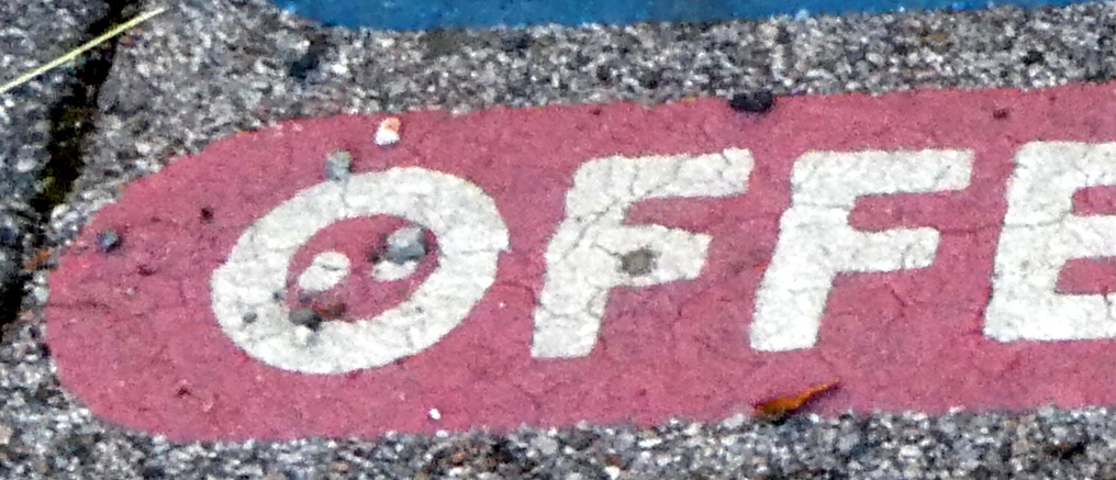
Sometimes you will see the dots placed inside the Ö, as in this word painted onto a street. It’s hard to see because there‘s a small pebble over one of the dots, but trust me, it’s there.
This is unusual, however. I think this is the only one I’ve ever seen.
More often, you will see a slash or an opening in the capital O to represent the umlaut. I am guessing that this is some sort of convention that designers use, and everyone just automatically understands it. It fulfills the purpose of having an umlaut with an O without using additional horizontal or vertical space.

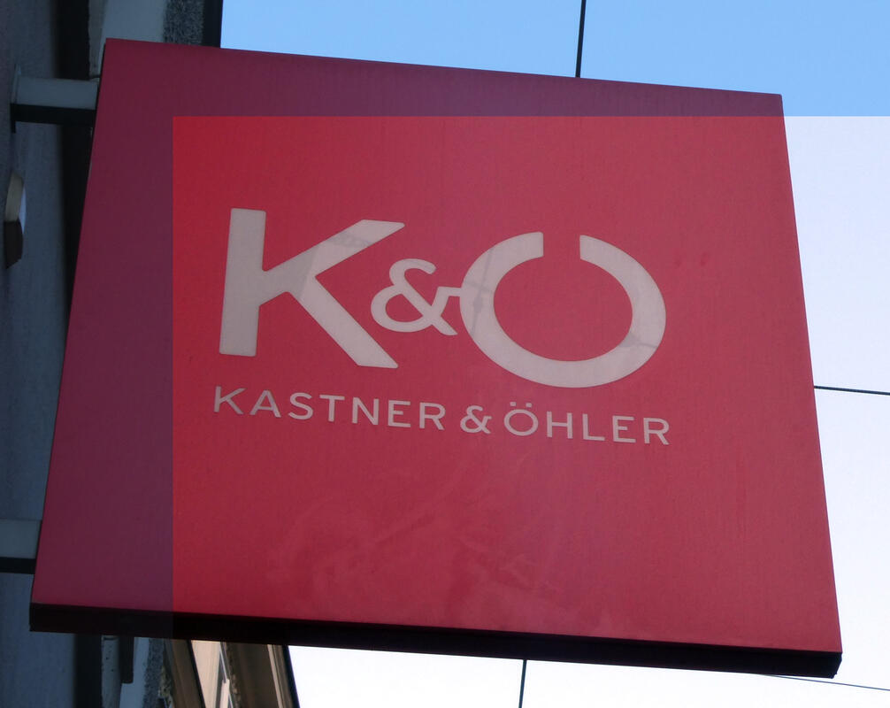
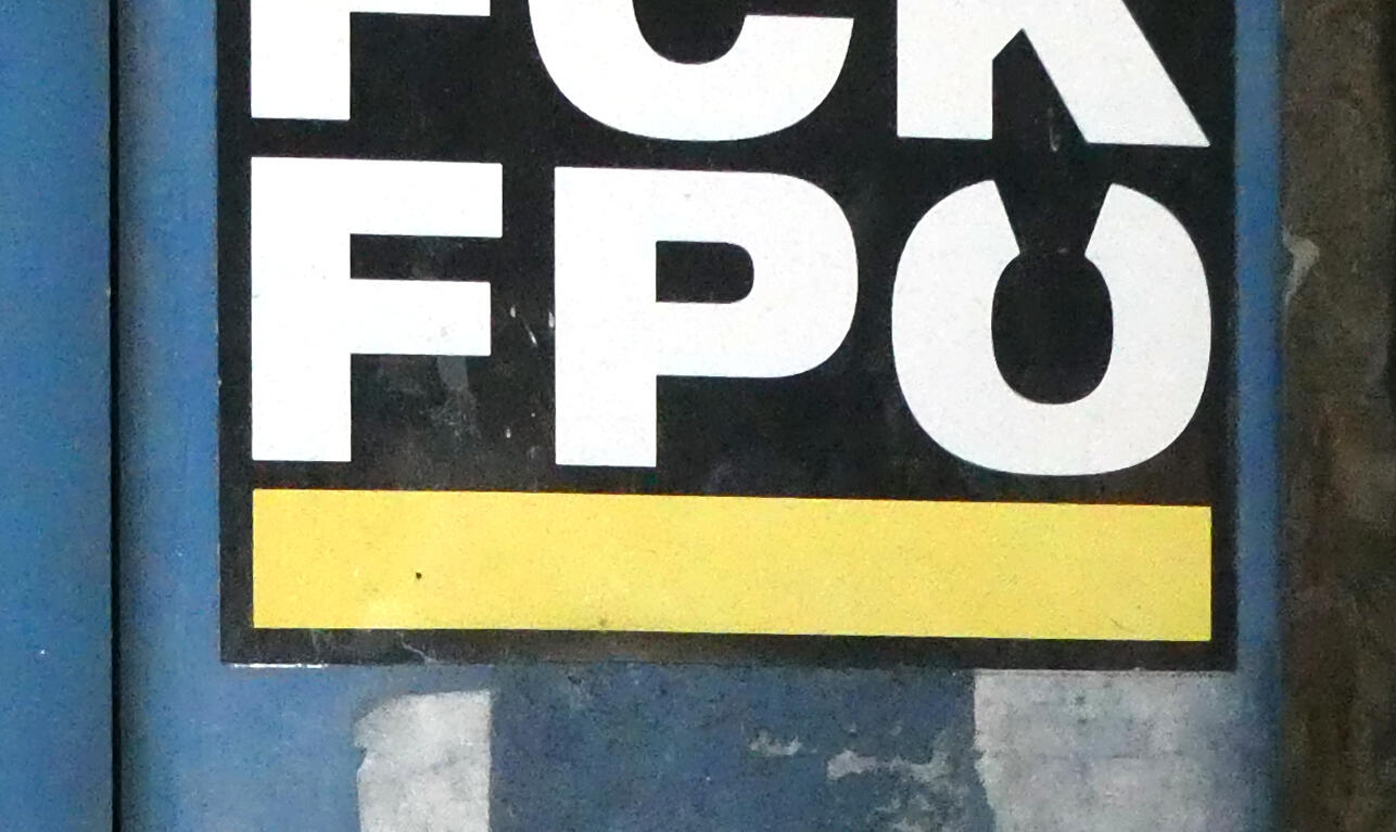
From all of this, I infer that the umlaut is more than just a part of the letter; it’s a design element in and of itself. Consider these:
Here, they write out the lower case ö as oe. This is valid if you are using a computer that can’t do umlaut letters. It fits better here because the company sells event tickets online—e-tickets—so „ötickets.com“, aside from possibly not being a valid URL, wouldn’t get the „e“ part of it across.

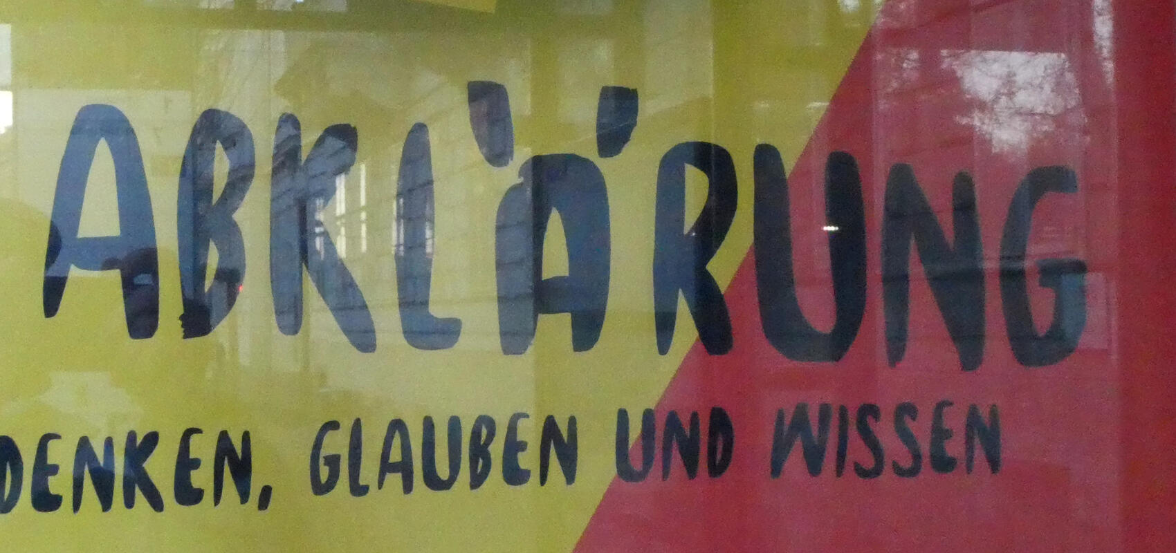
In handwriting, people will often use a horizontal line to save time instead of having to write two separate dots. (This is also the convention for the tilde in the Spanish “ñ”.)
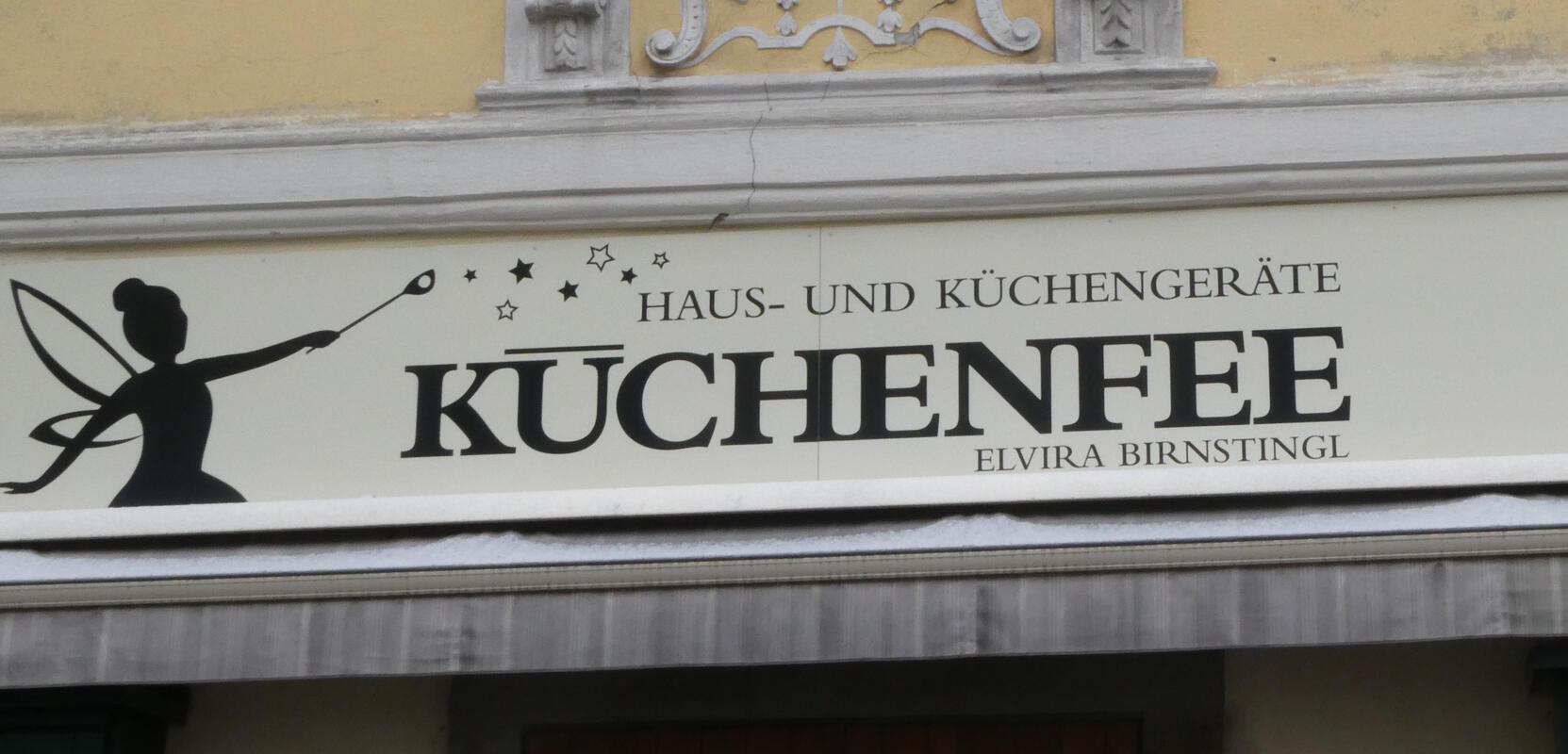
Clearly a design element here; the designer went wild with the dots on the umlaut. It’s not a logo, so space restrictions were not an issue.
And here, the Görtz 🇦🇹 company used a diagonal to represent the umlaut but didn’t bother to save any vertical space.