Graz–Jan. 27, 2025
I have no pictures from today (or from 28 January), so I will go back to typography and present...
Today’s Post is Brought to you by the Letter Ö - Part 1
Let’s talk about umlauts. Those are the two dots that appear over the letters A, O, and U in German. They aren’t accent marks. They don’t function the way they do in French or Spanish (or sometimes English), where they indicate that a vowel is pronounced separately from the preceding vowel: Loïc (a person’s name), vergüenza, and coöperate. Here’s an article that gives you more information than you ever wanted to know about the umlaut. Also this article, which is not as much fun to read.
Putting aside the origin story, let’s discuss what happens when you use umlauts in text and how it affects the vertical height of your text. For lower case letters, there’s no problem. The umlauts rest comfortably below the height of a capital letter:

Truth be told, I think the dots on the umlaut here are disproportionately large, but I am not a designer, and this may be the norm for Austria.
Let’s look at capital letters with umlauts. For ordinary text, the umlaut is normally placed above the character. This is, again, not a big problem, because most fonts are designed to include the space required for umlauts and accent marks in the vertical height of the letters.
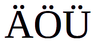
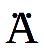
What happens when you want to design a logo, and vertical space is at a premium? With Ä, there’s no problem. You will almost always see the umlaut lowered and put at the side of the diagonals, where, again, there’s plenty of room without increasing your total height. The total width is also unaffected:
For Ü, the umlaut gets squeezed together and put in the interior of the letter. Sometimes you even see the dots placed vertically:


But what do we do with Ö? Go to the next page to find out!